Calculating Correlations
If you want to interpret not only the strength of the relationship but also the direction of the relationship, you can calculate the correlation.
This learning block introduces two correlation measures:
Pearson’s r
Spearman’s \(\rho\)
For the calculation of Pearson’s r, the following conditions must be met:
(pseudo-)metric variables
linear (monotonic) relationship
equal variance
(bivariate normal distribution)
For the calculation of Spearman’s \(\rho\), only the following conditions need to be met:
(at least) ordinal variables
monotonic relationship
Linear and Non-linear Relationships
The figure presents four examples that would all yield nearly identical statistical measures (Anscombe’s quartet).
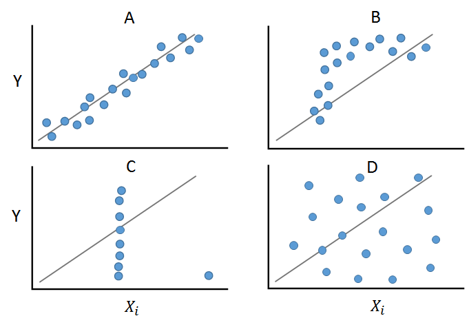
Panel A shows a linear and monotonic relationship between two variables. In this case, calculating Pearson’s r would be appropriate. Panel B, although showing a monotonic relationship, is not linear. In this case, Spearman’s \(\rho\) can be calculated. Panel C demonstrates how an outlier can alter the relationship structure, leading both correlation measures to provide a biased value. Panel D shows a non-linear and non-monotonic relationship.
It becomes clear here that before calculating measures, graphical analysis is helpful or necessary!
Example Correlation
Now you should calculate the correlation between Trust in Parliament (trstprl) and Trust in Politicians (trstplt) from the PSS.
Both variables are pseudo-metric variables, so you should calculate Pearson’s r.
To do this, you need to test the assumptions of Pearson’s r:
Sample of paired values \(\checkmark\)
both variables are metric \(\checkmark\)
Relationship between variables is linear
Testing the Assumption
You can easily check this by creating a scatter plot. You can use the base function plot() for this. We will learn the more powerful graphics library ggplot2 in the last learning block.
plot(
  pss$trstprl,
  pss$trstplt
)
Since the data is only pseudo-metric and many data points (integer) overlap, you can’t see much from the plot.
Solution: Use the jitter() function to spread the points more widely:
plot(
  jitter(
    pss$trstprl,
    3
  ) ~
    jitter(
      pss$trstplt,
      3
    )
)
This graphical analysis takes some getting used to: If you don’t see clear patterns like in the Anscombe quartet, you can assume a linear relationship.
In conclusion, we can state that the conditions are met:
Sample of paired values \(\checkmark\)
both variables are metric \(\checkmark\)
Relationship between variables is linear \(\checkmark\)
\(\Rightarrow\) You can now calculate Pearson’s r!
Calculating the Coefficient
To calculate the correlation coefficient, you use the cor() function (for both Pearson’s r and Spearman’s \(\rho\)). First, you need to name the two variables in the function. Then you should choose the correlation coefficient and finally select how to deal with NA's in the variables. Here, you delete any row that has an NA value in either of the two variables.
cor(
  pss$trstprl,
  pss$trstplt,
  method = "pearson",  # alternativ hier "spearman"
  use = "complete.obs"
)
## [1] 0.2318401The output shows a correlation coefficient of \(r \approx 0.232\). In this output, there is no p-value included, and you cannot make a statement about significance.
Calculating the coefficient with the library psych
With the library psych, you can use the function corr.test(), which also provides the significance test:
install.packages("psych")
library("psych")
corr.test(
pss$trstprl,
pss$trstplt,
method = "pearson",
use = "complete.obs"
) ## Call:corr.test(x = pss$trstprl, y = pss$trstplt, use = "complete.obs",
## method = "pearson")
## Correlation matrix
## [1] 0.23
## Sample Size
## [1] 4954
## These are the unadjusted probability values.
## The probability values adjusted for multiple tests are in the p.adj object.
## [1] 0
##
## To see confidence intervals of the correlations, print with the short=FALSE optionThis test generates three matrices (correlation matrix, sample size matrix, p-value matrix) that you can later use for visualization.
The additional information needed for the p-value is found at the last position. Here, a p-value of \(0\) is present.
Calculating multiple correlations
With both functions, you can calculate not only the correlation between two variables but also specify more than two variables directly. It will then calculate the correlation pairwise between all variables. To do this, use the function c() to specify between which variables you want to get pairwise correlation values:
cor(
  pss[
    ,
    c(
      "trstprl",
      "trstplt",
      "trstprt",
      "trstlgl"
    )
  ],
  method = "pearson",
  use = "complete.obs"
)
## trstprl trstplt trstprt trstlgl
## trstprl 1.0000000 0.22712300 0.3824902 0.22536686
## trstplt 0.2271230 1.00000000 0.3992831 0.05203906
## trstprt 0.3824902 0.39928307 1.0000000 0.24868786
## trstlgl 0.2253669 0.05203906 0.2486879 1.00000000corr.test(
pss[
,
c(
"trstprl",
"trstplt",
"trstprt",
"trstlgl"
)
],
method = "pearson",
use = "complete.obs"
) ## Call:corr.test(x = pss[, c("trstprl", "trstplt", "trstprt", "trstlgl")],
## use = "complete.obs", method = "pearson")
## Correlation matrix
## trstprl trstplt trstprt trstlgl
## trstprl 1.00 0.23 0.38 0.23
## trstplt 0.23 1.00 0.40 0.05
## trstprt 0.38 0.40 1.00 0.25
## trstlgl 0.23 0.05 0.25 1.00
## Sample Size
## trstprl trstplt trstprt trstlgl
## trstprl 4965 4954 4948 4953
## trstplt 4954 4989 4972 4977
## trstprt 4948 4972 4983 4971
## trstlgl 4953 4977 4971 4988
## Probability values (Entries above the diagonal are adjusted for multiple tests.)
## trstprl trstplt trstprt trstlgl
## trstprl 0 0 0 0
## trstplt 0 0 0 0
## trstprt 0 0 0 0
## trstlgl 0 0 0 0
##
## To see confidence intervals of the correlations, print with the short=FALSE optionBoth outputs show a correlation matrix. The variable names are given in the columns and rows. The diagonal is always \(1\) because the relationship between the variable and itself is \(1\) (perfect!).
How do we graphically represent correlations now?