Visualizing Correlations Graphically
You have now created tables in the R output. However, correlations are often better understood when visualized in graphs rather than tables.
Here, you will learn two ways to create such visualizations: once using the library psych and once using the library corrplot.
Library psych
The library psych provides a useful function, pairs.panels(), to graphically represent correlations and the relationships between variables. In this function, you specify the dataset or the variables you want to use as before. Then, you indicate the correlation method (pearson or spearman). Since pseudo-metric data is involved here, it is advisable to use the argument jiggle = TRUE to prevent data points from overlapping. Additionally, setting stars = TRUE will display the conventional significance stars.
The function pairs.panels() from the library psych is part of it.
pairs.panels(
  pss[c(
    "stfdem",
    "trstprl",
    "trstlgl",
    "stfeco"
  )
  ],
  method = "pearson",
  jiggle = TRUE,   # für pseudometrische Daten
  stars = TRUE  # Konvention für Signifikanzen
)
The whole thing looks graphically like this: The correlation coefficients are in the upper third, the univariate distribution of each variable is in the diagonal, and the bivariate distribution of the pair of variables is in the lower third.
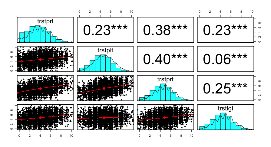
Unfortunately, the function is not as easy to adapt and expand as ggplots, which we will learn about later in learning block 5. There you will also learn about a ggplot variant to create Pairs Panels.
Library corrplot
Another way to visualize multiple correlations is a so-called Heat Map. To create this plot, you need the library corrplot and its function corrplot().
A Heat Map shows the strength of the relationship through the choice of colors.
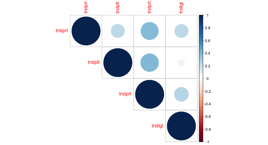
First, load the package corrplot:
install.packages("corrplot")
library("corrplot")
Then, create a correlation matrix using the function corr.test():
cor2 <- corr.test(
  pss[c(
    "trstprl",
    "trstplt",
    "trstprt",
    "trstlgl"
  )
  ],
  method = "pearson",
  use = "complete.obs"
)
As a result, we get a list object again, which contains three matrices: the correlation value, the sample size, and the p-value. However, for the heatmap, we only need the correlation value and the p-value.
cor2## Call:corr.test(x = pss[c("trstprl", "trstplt", "trstprt", "trstlgl")],
## use = "complete.obs", method = "pearson")
## Correlation matrix
## trstprl trstplt trstprt trstlgl
## trstprl 1.00 0.23 0.38 0.23
## trstplt 0.23 1.00 0.40 0.05
## trstprt 0.38 0.40 1.00 0.25
## trstlgl 0.23 0.05 0.25 1.00
## Sample Size
## trstprl trstplt trstprt trstlgl
## trstprl 4965 4954 4948 4953
## trstplt 4954 4989 4972 4977
## trstprt 4948 4972 4983 4971
## trstlgl 4953 4977 4971 4988
## Probability values (Entries above the diagonal are adjusted for multiple tests.)
## trstprl trstplt trstprt trstlgl
## trstprl 0 0 0 0
## trstplt 0 0 0 0
## trstprt 0 0 0 0
## trstlgl 0 0 0 0
##
## To see confidence intervals of the correlations, print with the short=FALSE optionls(cor2)## [1] "adjust" "Call" "ci" "ci.adj" "ci2" "n" "p" "p.adj"
## [9] "r" "se" "sef" "stars" "sym" "t"Now you can create the plot:
corrplot(
  cor2$r,
  p.mat = cor2$p,    # Matrix mit p-Werten
  insig = "blank",   # nicht signifikante = leer
  type = "upper",    # auch lower möglich
  method = "circle" # verschiedene Optionen möglich
) The library corrplot offers you a range of additional settings, which you can view here. We will delve deeper into graphics in the fifth learning block.